Monday, December 12, 2016

Final Exam Review

1. Caption Rules:

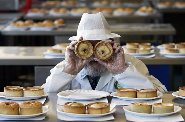
World Pie Championship jury member John Young poses with two scotch pies during the judging of the competition in Dunfermline, Scotland.

Inspecting pies, Billy Silk poses with them at the Dallas Culinary School. The school was having a baking competition, after students had learned how to create pies.

2. Rules of Photography:
1. Rule of thirds: subject is not placed directly in the center.
2. Balancing elements: 2 contrasting elements that help to balance each other. Example: something small & something large.
3. Leading lines: some sort of line(s) that draws your eye through the photo.
4. Symmetry and patterns: an element that repeats throughout the photo. 
5. Viewpoint: taking the photo from a different angle. Example: up high or down below.
6. Background: should be simple, so the subject can be the main focus.
7. Create depth: allows objects to seem far away or close up.
8. Framing: gives more information to the photo based on where you are standing.
9. Cropping: helps to get rid of distracting elements.
10. Mergers & avoiding them: when something appears to be coming out of something else.

3. Aperture, Shutter Speed, & ISO
Aperture: the f stop. Smaller f number means more light and bigger f number means less light.
Shutter speed: how fast the lens closes and opens. Slower shutter speed lets in more light and faster shutter speed lets in less light.
ISO: the camera's sensitivity to light. High ISO allows the picture to be lighter, but adds more grain. Low ISO allows pictures to be better quality, but you must have an adequate amount of light.

4. Ethics of Photo Manipulation
Photos should not be manipulated to the point where it is no longer the truth of the original image. Smoothing skin would be ok, but dramatically enlarging or thinning something would not be ethical.

5. Types of Portraits
Environmental: the subject is photographed in their natural environment.
Self: a photo of a person, taken by them.
Casual: a casual photo of a person.
FORMAL: person looks into camera and is nicely dressed vs INFORMAL: person may look away and not posed

6. Photography Terms
Exposure: how light or dark the photo is. "over exposed or under exposed"
Depth of Field: how much of the photo is in focus.
Focal Length: the distance between the sensor and lens. 4 mm would be a very far away shot, and 300 mm would be a very close shot.

7. Types of Magazine Covers
Early: illustrations on covers.
Poster: one large captivating photo covers front.
Married to Type: words work with picture.
Forest of Words: lots of text surrounding photo, easily lost.

Magazine Covers Finale


Wednesday, November 30, 2016

Magazine Cover Images


Portraits & Self Portraits


Top 100 Photos of All Time #5


1. I picked this image because of the bright colors in it. It caught my eye because of how far away it was taken and the amount of stuff in it.

2. I learned that this photo is multiple photos put together. Also, that is was one of the most expensive photos ever sold.

3. Further reading, I learned that it sold for $2.3 million at an auction.

5. Andreas Gursky
Born in 1955 - still alive
Born in Germany
Education: Kunstakedemie Dusseldorf


Top 100 Photos of All Time #4


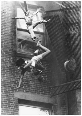
1. I picked this image because the children falling in mid air, so high up, caught my eye.

2. When Forman was taking this picture, he thought he was just shooting a fireman doing a rescue. But then, all of a sudden the fire escape broke, and he captured the 2 people falling. 


3. I learned that this photo led to a change in the stability of fire escape safety codes.


5. Stanley Forman
Born in 1945 - still alive
Born in Winthrop, MA
Education: Benjamin Franklin Institue of Technology


Monday, November 28, 2016

Top 100 Photos of All Time #3


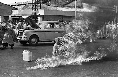
1. I picked this image because there is a person on fire, and that for sure caught my eye.

2. This photo created a lot of emotion for people, especially concerning the U.S. The U.S. began to question their interference with Diem’s government and their practices.

3. The audio from the photographer provides the information that he was notified something was going to happen. Once he arrived, he explained the process of what happened. 


5. Malcom Browne
Born on April 17, 1932 - Died on August 27, 2012
Birth place: New York City, New York
Education: Swarthmore College

Top 100 Photos of All Time #2


1. I picked this image because the men just casually sitting a top a beam caught my eye.

2. This photo was actually staged for a promotional campaign for the skyscraper complex. The photographer of this photo is mystery, they do have it narrowed down to 3, but they are unsure by who.

3. The video provided me with the information that all these men were from different countries, and came there to work. Also, that this allowed many, many people to have jobs during the Depression and this was a positive. 

4. The photographer is unknown.

5. The photographer is unknown. 

Top 100 Photos of All Time #1


1. I picked this image because the little boy lying flat on the shore caught my eye.

2.  This boy and his family were leaving Syria on a boat. The boat was sunk by a wave and all of them drowned. He had only appeared to be sleeping on the shore, but when found, he was dead.

3. The additional text with this photo tells about the war going on in Syria and how many Syrians would want to escape to Europe. Since Kurdi was lying on the European shores, this gave them the hope and possibility of coming.

4. I wasn’t able to find any other photos the photographer had taken. 

5. Nilüfer Demir
Born in 1986 - still alive
Birth place: Bodrum, Turkey
Education: Has worked with Dogan News Agency since she was a teenager.

Wednesday, November 16, 2016

Fashion Photography

1. They made her lips bigger, moved her eyes down, elongated and slimmed her neck, adjusted her hair, made her eyebrows and eyes bigger, and added more shading around the edges of her face.

2. They evened out her skin tone, slimmed her stomach, made her legs longer, made her feet smaller,  made her neck longer, and made her skin lighter and shinier.

3. In this video, the model was very highly edited. Her overall body was dramatically slimed and made smaller, her chest was made smaller, her waist made tinier. They even gave her more hair, and added more shadows to her body. 

4. I don’t think it is ethically acceptable to change a person’s appearance like this because it is not realistic and not showing the truth.

5. I think if a persons skin tone was to be completely changed, darker or lighter, or something was added to their body, then that could be more wrong than what has previously been done. 

6. I think evening out skin tone is ok or covering up minor imperfections, but majorly enlarging or sliming shouldn’t be done.

7. I think photojournalism captures the most true and accurate photo of a situation, as to a fashion photo where it may be edited and not contain the whole truth. 

8. Each type of photography attempts to show the reality of something. This affects ethical practices because the photos aren’t always truthful.

9. I think you showed us these three videos. so that we can see how dramatically people can be edited in Photoshop and that not everything we see is correct.

10. None of these videos are about guys because typically we don’t think about guys being edited, we think they are normally tone. Along with that, it is more thought that girls care about body image.

Monday, November 14, 2016

Killer Timelapse

http://blog.ted.com/how-to-create-a-killer-timelapse-with-joe-capra/

This website showed a video of a bunch of time lapses put together. Then under the video there was writing about the creator of the video and an interview they did with him. 

I learned that time lapses take quite a while to take because you have to take a lot of shots, but in the end they turn out looking really good. 

In the video I saw all of the time lapses Capra took in Rio. The video was made by Joe Capra. The story tells about how he got started, where he’s been, and how long they take. It also tells about how he makes sure they are paced. 

The Oldest Living Things in The World

http://www.rachelsussman.com/oltw/

On this website, I saw pictures of some of the oldest things that are still living in the world that have been captured in photos. I like Sussman’s simple photography style. 

I learned that you can make the simplest things in nature look beautiful.


I picked this photo because I like the cool toned color of it. I see simplicity in this because there isn’t anything distracting elements in the photo. This photo was taken by Rachel Sussman.  


Spiral Staircases

http://petapixel.com/2014/12/19/disorienting-beauty-spiral-staircases-old-abandoned-buildings/

This website shows photos of old buildings and their spiral staircases. The examples in this were all taken by Christian Richter and he talks about how he got into taking them.

I learned that taking photos at different angles can be very disorienting and it has a cool effect.

spiral staircase with railing
I picked this photo because when I first looked at it, I wouldn’t have thought “staircase”. I see rule of thirds in this photo because the circle is off centered, and that draws your eye through the photo. This photo was taken by Christian Richter. 

Using a Projector

http://petapixel.com/2015/01/01/projector-brought-forest-turns-nature-glowing-wonderland/

This website showed how these two guys went into a forest and used a computer, projector, and a DSLR on a slider. With this, they took photos of the nature with projections on them. 

I learned that there are very creative ways to make photos more interesting, and this is one of them. 

Screen Shot 2015-01-01 at 12.20.31 PM
I picked this photo because I like the luminescence the mushrooms have on them. I think they almost look like something from a galaxy. I see simplicity used in this photo because there is nothing distracting from the mushrooms. This photo was taken by Tarek Mawad.

Photos Everyone Should Know How to Make

http://petapixel.com/2014/12/01/6-types-photos-know-make/

This website shows 6 different photos that they think everyone should know how to make. I think they are all very visually interesting and appealing, and would it would be cool if I knew how to create them. 


I learned the different ways to achieve the effect in each photo. 


6photos_2
I picked this photo because I like the “forced perspective”. In this photo I see rule of thirds by having the girl off centered. The photo was taken by Kenzie Saunders. 

Thursday, November 10, 2016

Magazine Part 2

IMAGE BASED: On image based covers, there is usually one person, looking at the camera, smiling. This is typically used on celebrity magazines, and that is why they sell the way they do. Sometimes, magazines will change the cover and make the person not smiling, or not looking at the camera. The most important thing is that the photo on the cover must relate to the style of the publication.

ILLUSTRATION BASED: Illustration based magazines are not that common today. When used, they do not rely on selling in newsstands. They are used to show something funny or out of the ordinary. The New Yorker is the most notable magazine that uses illustrated covers today.

TYPE BASED: Type based covers are usually powerful, and striking. Type can sometimes provide messages better than photos can. These are more popular than illustrated covers, but still not that popular. Recently though, they have been used more because of handwritten letter forms and modern calligraphy.

CONCEPT BASED: Concept based magazines are typically a mix of all three types. They also provide a strong message or something funny. The struggle with them is that need to be easy to understand, and that can be difficult. This type of magazine cover is not used often.

Words and photos on magazines work well together to provide information for readers. This is important because photos can give lots of info, and words help to add to this.

My Favorite Cover

The New York Times Magazine, November 24, The Flight Risk
Photographer: Martin Schoeller
Designer: Arem Duplessis
"For this cover story on the U.S. women’s ski-jumping team, we featured the Olympic hopeful Sarah Hendrickson as photographed by Martin Schoeller. Schoeller captures the competitive spirit of Hendrickson, who wears her competition gear, in her body posture and intense gaze."


It is portrayed that this woman skis, obviously from what she is wearing. You can tell from the expression on her face that she is very serious about it. The title and description underneath help to explain what the story inside is about. In my opinion, I think the photo could contain something more. It is a little boring and an additional element could draw the reader in. That said, this is a good portrait with even lighting with a simple background. I like how everything is in focus since it is simple.

Monday, November 7, 2016

Best Magazine Covers 2013

1. formal
2. informal
3. informal
4. environmental
5. environmental
6. environmental
7. informal
8. formal
9. formal
10. formal
11. informal
12. formal
13. informal
14. formal
15. formal
16. formal
17. informal 

Magazine Tips

5 things to think about when designing your magazine cover:

1. Familiar recognition from issue to issue (the brand)
2. Emotionally irresistible (the image's appeal)
3. Arousing curiosity (should pull the casual glancer in)
4. Intellectually stimulating and interesting (promising benefits)
5. Efficient, fast, and easy to scan

Portraits & Self Portraits Preview

1. Experiment with Subject Expressions: In some portraits it is the expression on the face of your subject that makes the image. Get your subject to experiment with different moods and emotions in your image. Play with extreme emotions.

2. Shoot Candidly: Sometimes posed shots can look somewhat…. posed. Some people don’t look good in a posed environment and so switching to a candid type approach can work. Photograph your subject at work, with family or doing something that they love. This will put them more at ease and you can end up getting some special shots with them reacting naturally to the situation that they are in. 


CASUAL PORTRAITS
I like this photo because it is simple and show cases her. I choose it because of the nice background. 


I like this photo because of the bright whites, and lighting. I choose it because he is the subject, and there isn't distracting elements around him. 

PHOTOGRAPHY SELF PORTRAITS


I like this photo because it makes you wonder why. I choose it because it the elements of it are interesting. 
I like this photo because of the letters floating all around him. I choose this because it makes you think about why the letters are around him. 

ENVIRONMENTAL PORTRAITS

Image result for environmental portrait
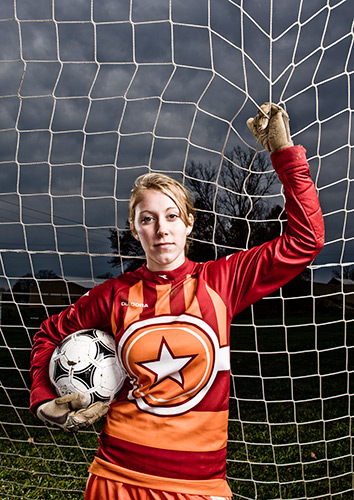
I like this photo because of the darkness in the background. I choose this because she stands out and her pose isn't boring. 


I like this photo because of the sparks in the background. I choose it because you can clearly see what his job is.

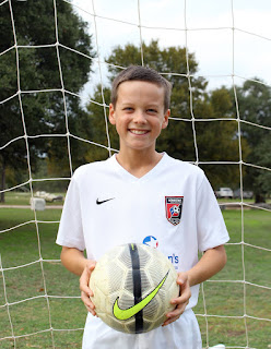
For my portrait assignment I think I will shoot my little brother at the soccer field and maybe my dad at work. To make this successful, I will make sure to adjust the settings to have good lighting and use the photography rules to make the photos interesting and more visually appealing. 


Wednesday, November 2, 2016

American Soldier

A. I think one of the most powerful images was the one of Ian coming home to see his family and he was at the airport. He looks so happy to see his family, and I would be too. After being gone for so long, all he can do is smile.

B. The images work together to tell a story because they capture so many different elements of his life. Not just what goes on in the army, but his family and social life too. 

C. The captions enhance the photos by giving you information you would not have know by just looking at the photo. 

D. Ian Fisher joined the Army after graduating high school. Saying goodbye to his family and friends was very hard. As training began, he was struggling. He was getting injured often, affecting his position in the Army. Along with that, he also had an issue with drugs. He had had girlfriends, but none of them really worked out. Eventually he finds the one, gets married to her, and they start their life together after having shared his time in the Army. 

E. The first sentence of the captions is written with present tense verbs.

F.
1. On average, the captions are about 2 sentences.
2. The first sentence provides information on what is happening in the photo.
3. The second sentence provides background information on the situation.
4. If there is a third sentence, it will either give more background information or a quote. 
5. Yes, some captions include a quote.
6. Yes, there are captions with 4 sentence, but not many.

G. I think it is possible to tell a complete story with just photos and captions because you can gather so much information from just looking at the pictures.

H. Stories should still be written because they provide other information that you can't see in the photo. Although second sentences do that, they are related to the information in the picture. There might be information that was not taken a picture of, that the story could include. 

Monday, October 31, 2016

Composition Rules: Part 2


DEPTH

MERGERS
CROPPING

FRAMING
BACKGROUND
VIEWPOINT
SYMMETRY
BALANCING ELEMENTS
LEADING LINES
RULE OF THIRDS

Wednesday, October 26, 2016

Funny Captions


With his arms outstretched, 75 year old Joe Watkins skydives with his friend Billy Brown. Watkins had always had the dream of one day skydiving, and now he finally had. 


At the Florida Zoo, George Hopkins lets monkeys crawl on him. This was a one of a kind experience for Hopkins, as monkeys were his favorite animal and as a kid his parents never let him go to the zoo.


At the Happy Meadow Retirement Home, Iva Jean receives a set of workout videos for her 80th birthday. Jean had curlers in her hair as she was preparing to go out and party later that night.


Monday, October 24, 2016

Prompt Shoot #2

PURPLE
ELECTRIC


COLD

Warm Up

1. As I looked through these photos, I could feel the pain and struggle they were both feeling, but at the same time the great amount of love they shared together. 

2. After looking at these photos, I think this comment means that even though she was diagnosed with cancer, it did not define them. They could still share happy memories and love together that was not captured on camera. Even though most of the photos show pain.

3. If I was in this situation I do not think I could capture photos like this. These photos have such a powerful feeling portrayed in them, and if I was in this position I don't think I could be taking photos. 

4. If I could write a letter to Angelo, I would tell him that he captured the end of his wife's life beautifully. 

Monday, October 17, 2016

Africa & Abandoned Theme Parks

AFRICA

1. I was impressed by Nick Brandt's photographs and how he was able to get so close to the animals. I was quite surprised by the amount of time he would wait to take one photo. Eighteen days, in my opinion, is a very very long time to wait to take a photo. But, this goes to show that he is a good photographer and will wait for just the right moment to capture an image.


3. This photo shows cheetahs gathered around each other, I'm guessing a family. This is one of my favorite photos because it shows the dominance of the cheetahs in their surroundings.

4. Simplicity is used in this photo. I know this because there is nothing distracting in the background, it is just a solid color.

5. Brandt uses a Pentax 67 camera with a fixed lens. This is important because when using a fixed lens, there is no zoom. Brandt believes that being close to the animals makes a difference in the photo.

6. Brandt takes these photos to simply just show their state of being and that they exist.

7. He hopes that from taking these photos, he can show people just how amazing these animals are. As they begin to die off, he likes to capture their beauty.

8. "I'm not interested in creating work that is simply documentary or filled with action and drama, which has been the norm in the photography of animals in the wild. What I am interested in is showing the animals simply in the state of being—before, in the wild at least, they cease to exist."

ABANDONED THEME PARKS

1. I would like to visit Spreepark in Berlin, Germany. I would want to go here because there appears to be a lot of color for it being abandoned. There is a lot of forest surrounding it which I feel could be a good element for making the photos look older. Along with that, it also has lots of large objects which would photograph well against all the brush.


3. Unusual places interesting to photographers: abandoned library, inside a cave, old stadium, old airports, or an old bowling alley. 


5. I think it would be fun to take photos at abandoned libraries because they are usually so organized and clean. All the books are put up on the shelves, and now they are not. Their scattered along the floor. I think I could get overview shots. Along with close up detailed ones of the old books. 

6. To take photos at an abandoned library, I don't think it would be very hard. I'm guessing there would be one in the US and I could just fly there to take the pictures. As for equipment, I would probably use just need a zoom lens for some up close shots. 

Wednesday, October 12, 2016

Great Black and White Photographers: Part 3

1. The scenery in the photos really captured my eye. I thought it was interesting how he could make something so simple look so intriguing. 
Image result for ansel adams tree


I see the sun rising on a chilly spring day. I see the morning dew on the grass.
I smell the fresh cold air. The air that I, and everything around me breathes in.
I hear the birds chirping as the sun warms the Earth. Their quiet pecks echoing around me.
I taste the rich air. It's very cold.
I feel the breeze against my cheek. I feel the sun warming my body.Image result for ansel adams lake

I see a vast expanse of land. Land with enormous mountains and flat plains.
I smell the fresh pine trees on a winter day.
I hear the quiet rush of water. It calms the atmosphere.
I taste the humidity in the air.
I feel the chill brush against my body. It sends a cold rush throughout me.

3. I think we should create posters to show the class our photographers.